5 Album Covers That Show The Genius Of Hipgnosis
Hipgnosis is one of the most prolific and influential graphic design collectives in the history of music, but which albums show the true extent of their abilities?

Our story starts in 1968 with two college students, Storm Thorgerson and Aubrey Powell. Their first cover creation came about when their friends from a small little unknown psych band named Pink Floyd requested them to design the cover for their second album, *A Saucerful of Secrets*. EMI noticed their work and brought them new assignments, including work for Free, The Pretty Things, Toe Fat, and The Gods. When they were students of the Royal College of Art, they used the college's darkroom, but after graduation, they needed to make one themselves. At first, they set up a makeshift darkroom in Powell's bathroom, but soon, in early 1970, they rented a space and built a proper studio. This just happens to be the same location, 6 Denmark Street, that the Sex Pistols lived and recorded at in the later 70s. The name "Hipgnosis" came from graffiti on the door of their apartment. Thorgerson explained that they appreciated the word for its play on "hypnosis." It's a combination of "hip," which means cool and new, and "gnosis," which is a Greek word for knowledge. As Hipgnosis continued to gain recognition, their innovative and unconventional approach to album cover design garnered them more high-profile clients. Their reputation for creativity and lateral thinking set them apart, allowing them to work with some of the most influential and successful musical acts of the time.
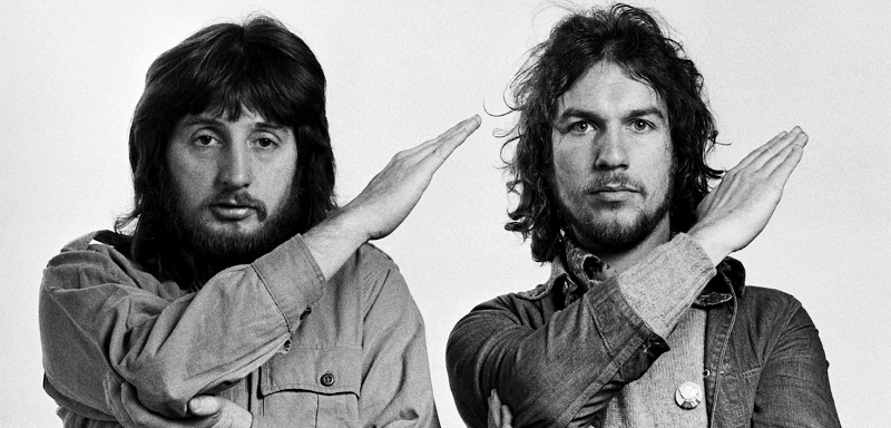
Storm Thorgerson and Aubrey Powell
By the early 1970s, Hipgnosis was well-established and sought after for their ability to create visually striking and thought-provoking covers. The team expanded with the addition of Peter Christopherson in 1974, who brought his own unique perspective and skills to the group, and they would expand more, adding more members, making it a full blown design firm. Hipgnosis became known not only for their elaborate and imaginative album covers but also for their flexibility and willingness to experiment with different styles and techniques. This adaptability ensured that their designs remained fresh and relevant throughout the evolving music scene of the 1970s and early 1980s. Over the years, they embraced new technologies and methods, constantly pushing the boundaries of what could be achieved in visual design. Their influence on the field of album cover art is still felt today, as they helped elevate it to an art form in its own right. Despite the changing landscape of the music industry, Hipgnosis's legacy endures. Their innovative spirit and dedication to their craft have left a highly noticeable mark on the world of music and design, inspiring future generations of artists and designers. Now that you have a little background, let's go through 5 albums that explain their genius.
Dark Side Of The Moon (1973)

The album cover for 'Dark Side Of The Moon' by Pink Floyd
They had already worked with the band many times, creating their previous 6 album covers, but this time the band wanted something different. The company's previous albums had all been these surreal pieces of photographic excellence, but the band wanted to change the status quo, and they did with the music on this album. They had met the band at Abbey Road and were met with a specific comment from the keyboard player Richard Wright. "Ugh, do we have to have one of your bloody surreal designs again? Can't we have something that's really stylish, like a singular image, like a chocolate box?" You see, there was this chocolate box called Black Magic, with a simple box and just the words and a line. So yes, that does mean one of the most important album covers of all time was inspired by some chocolate. They left the studio feeling rather uninspired, but they're not ones to give up. Aubrey was looking through old French physics books, and one of the images was of a paperweight with light shining into it and a ray of rainbow light coming out, and that's when it hit him. He would make it a prism. It makes sense too, Pink Floyd's whole thing at the time were their light shows. They hadn't just made that idea, and had brought a bunch of other designs to the table on that day, but there was no need, as soon as they set that prism down they all knew that was the one. Storm was somewhat upset about the band being so certain after they had created all the other ideas, but nonetheless they went on with the prism. They didn't know how to create the exact illustration, so they employed their friend George Hardie to actually create the final product. Storm was somewhat unsatisfied with it, he said "That's it. It's a triangle." he knew they needed to do more. They hopped on a plane to Egypt to take pictures of the pyramids. These would be used in a poster that came with the album, along with stickers pertaining to pyramids. The album's cover was made very simply, just 3 layers of paper, a bit of airbrushing, and a lot of printer instructions. What this album really shows is their ability to adapt to a style that might be out of their comfort zone.
Wish You Were Here (1975)
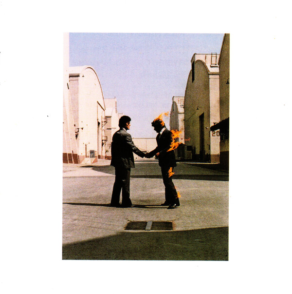
The album cover for 'Wish You Were Here' by Pink Floyd
According to Powell, the idea for the cover came from a conversation with the band about insincerity in the music business. The whole album is about insincerity and absence, the latter more particularly in the sense of Syd Barret. The 2 sat down and started thinking about that concept, absence and insincerity in terms of business. There's also this expression, getting burnt, something like "Aw man I just got burnt" it basically means getting tricked or screwed in some way, and in the sense of this album, Pink Floyd felt they were getting screwed at times. So what Hipgnosis did is take this concept to its logical extreme, they actually burned something, well, set it on fire at least. They had all these concepts and put them together, 2 businessmen shaking hands, and one of them is on fire. Now comes the hard part, they have the concept for this great shot, but now they actually need to get it. Obviously they needed someone to set on fire, but in LA that wasn't too hard to find. A stuntman named Ronnie Rondell agreed to be set aflame multiple times for this shoot. Another man, Danny Rogers, was to shake hands with Ronnie. They went to the Warner's building in Burbank. The thing that set this shot apart from other fire shots was one simple thing, in most shots you're running, but here, he would be standing completely still. In a running shot the fire is behind you, going away from your face, here though, not necessarily. They lucked out though, there was almost no wind on the day of the shoot. The small amount of wind there presented a small problem as the direction wouldn't match up with their mockup. To counteract this they simply took the photo with Ronnie on the left, and Danny on the right, and flipped it in the darkroom. They took 14 shots, but on shot 15 a wind gust blew fire right into Ronnie's unprotected face, singing his mustache. Ronnie was saved by his crew who extinguished the fire. Afterwards he got up and said "That's it. I'm never doing this again." Luckily for Powell, he got the shot. The ideas up to that point came from Powell, but Hipgnosis was a partnership, and Storm knew it needed something else, so he added the singing of the photograph, which adds to the sense of mysticism, adding this 3rd dimension to the scene. But if you bought the album when it first came out you at first wouldn't see this work of art, you would see a similarly recognizable design of 2 mechanical hands shaking on the black shrink wrap background. This was designed by George Hardie, who also made the final product for Dark Side Of The Moon.
Going For The One (1977)

The full album cover for 'Going For The One' by Yes
Yes were in an interesting spot in 1977, only 3 years earlier Pianist Rick Wakeman left the band, unhappy with their previous album "Tales of Topographic Oceans". But Yes wouldn't let this slow them down, they went on a highly successful 1973-74 tour, and released an album "Relayer" in 1974. The album peaked at 4 and 5 in the UK and US respectively. They continued going on successful tours, with each member releasing solo material. In 1976 the band was ready to record a new album, and with a new album came a new cover. Originally the band had asked Roger Dean, their long-time collaborator on album covers, but there were misunderstandings within the band that led to him not creating the cover. This was ok though, as the band was moving into a new era, a more modern and sleek era. Hipgnosis was the perfect fit. The band wanted to have something at least similar to Dean's work though, and Jon Aderson had suggested buildings as an idea to bridge the gap between Dean's work and Hipgnosis'. This would stick. Powell had realized that he had earlier been shooting in LA for Paul McCartney and had been in Century City where he remembered the Century Plaza Towers. He flew out, took pictures of them and came back, where they decided on a man swimming through the sky, with various elements flying around him. They worked again with George Hardie to create the cover. Richard Manning, a freelancer who was working with hipgnosis, had also employed techniques to make the colors pop, and added some extra elements like the clouds in the background. Finally they added Dean's original "Yes" logo to the design, which the band now had ownership of, and added it to the cover. Jon said that they had interpreted Roger Dean photographically, which made sense with the band's forward-looking ideas at the time, but they didn't completely throw away their tradition. It was still an expressive and complex photo, but not to the same level of complexity as Dean's work. That sentiment also works with the band's sound, still complex, but not like their previous albums.
In Through The Out Door (1978)

One of the many album covers for 'In Through The Out Door' by Led Zeppelin
1978 was a hard time for Led Zeppelin, they were all coping with the death of Robert Plant's son, Karac the previous year, as well as the taxation exile they took from the UK, which meant they couldn't enter the country for 2 years. The band was going through a lot of struggles at this point and trying to get into the public mind again was like trying to get "In Through The Out Door". Hipgnosis went all out with this album, and employed more techniques than any of their previous covers had. We'll go from the outside in. Similar to their black shrink wrap on Wish You Were Here, the album came in a brown paper bag with a faux stamp on the front and back denoting the albums title and tracklist. This is very similar to bootlegs at the time, which would often use stamps instead of using more money to print paper, or make a custom cover. This bag wasn't just for aesthetic though, it was actually to conceal the next thing to talk about with this cover, the variations. There are actually 6 different covers of this album. The different variants were labeled A-F on the album's spine. At first this might just seem like a simple gimmick, but in fact there's way more to the story than I originally thought. Each of the covers on the front and back is a shot of a bar, made to imitate the Old Absinthe House, in New Orleans, but was actually shot on a soundstage in London. Each cover depicts a different person's viewpoint, and there are 6 characters excluding "John" , the man sitting at the bar in the white suit who is burning a letter his girlfriend had sent him telling of their breakup. Another element that they included was that the person closest to the center of the shot, not counting John, on the front cover, was the perspective you would have on the back cover. The shot was taken in sepia, Storm said that it was meant to invoke a non-specific past, and the paint lick was to give a new look to an old scene, which is what the band said the album represented. The final layer is the innersleeve which is actually the 7th perspective, "John"'s. It features an ashtray, cigarettes and various other elements at the bar. At first glance this simply seems like a black and white inner sleeve drawing, but when water is applied pastels come out in the open. This even gives the paint stroke on the cover a second meaning, hinting to the water application on the inner sleeve. So clearly this album had a ton of thought put into its packaging, and this was recognized, being nominated for a Grammy in 1980 for "Best Album Package" their 6th and last nomination for this award, and I don't know what the people over at the Grammys were thinking but they didn't win a single time.
Peter Gabriel/Melt (1980)

The album cover for 'Peter Gabriel' AKA Melt by Peter Gabriel
When Peter Gabriel recorded his third solo album in 1979-1980, his solo career's future was uncertain, with his previous 2 albums being critically acclaimed, but commercially not so great. This performance had labels concerned about his status in the commercial world of music. However, his third album, released in May 1980, would change his legacy. The cover's concept stemmed from a dream that Hipgnosis co-founder Storm Thorgerson had about a dripping face. The resulting cover featured a distorted Polaroid image of Gabriel, manipulated during its development. This technique, known as a krimsograph and pioneered by Les Krims, involved pushing the undeveloped Polaroid chemicals around to create odd shapes and effects. Gabriel always liked a face on the album cover, but was very open to experimentation with the base image. The creation process was a collaborative and playful session that felt like an art school project. Gabriel, Thorgerson, and about fifteen others spent an entire day in the studio, taking numerous Polaroids and manipulating them to achieve the perfect effect. Gabriel loved the experimentation, and wanted to use multiple images, but Storm preferred a single, impactful image. Ultimately, the chosen image was strikingly grotesque and memorable, perfectly encapsulating the album's unsettling themes. Despite initial hesitation from his label, the album, known as "Melt" proved successful. The cover, with its grotesque and distorted depiction of Gabriel's face, was a bold artistic statement. It reflected the album's adventurous and particularly dark nature. Peter Gabriel's third album set the stage for his global commercial success throughout the 1980s, topping the charts in Britain and France, and gaining more popularity than his previous works in the US. Well there you have it, 5 albums that show just how crucial Hipgnosis was in the album world of the 70s and beyond. They pioneered techniques, created styles, and made some of the most iconic covers of all time.